Being able to manipulate an image in different ways has always interested me, and I love seeing the process that photographers go through to create their images, as its fascinating what people can do to an image, whilst making the final product look so natural and realistic. Here are some examples of post production I have recently tried and tested on my own work.
The first test I did was to add a dragon into the image, to be able to show a child imagination visually. Before beginning the process of adding the dragon into the image I focused on getting the image factors right, e.g exposures, contrast and colour.
Once I was happy with the base of image I imported it into photoshop where I began to add the fantasy aspects. To start with I added the dragon, before scaling and positioning it into the perfect place, I wanted to place it above Jack and his line of sight so it looks as if Jack was actually looking at the dragon when the photo was being taken. When I first added the dragon I was happy as the dragon didn’t blend well into the image, for the dragon to blend in to the image more naturally, I changed the contrast so it was higher and brought the brightness down so he appeared darker.
I then added the smoke coming out of the dragons mouth, when adding the smoke it was originally too transparent, so the audience would not have been able to see it clearly, to solve this problem I copied and pasted the layer, which made the smoke more dominate. Lastly I added some smoke around the bottom of Jack, to do this I used the brush tool and paint some white blobs on bottom of the image, once I was happy with where I placed the paint I then used the Gaussian blur effect to blur the paint and to give it the smokey effect.
Original image – Final image –


Tools used –

Before I did the shoot my original aim was to add a dragon into the image as I have done so above, as I felt it went well with the sword and dark tones of the image. However when on location with my model Jack, kept “cutting down” the trees with the sword, until he stopped at one tree and said “I can’t chop this tree down, a fairy lives here!” due to there being a hole in the tree, I thought this was really cute and wanted to incorporate it into the image also, as people can then image what it was like being a child again and how big their imagination can be. Creating this image was a little more straight forward than the dragon as I didn’t need to change the tones or add some smoke to the image.
To create this image I went onto PNG Tree and found an image of a fairy I liked, this deemed more difficult than I thought due to there being so many styles and positions of the fairy, however I soon found one I like and downloaded it. Once the image was downloaded I then dragged it into the image of Jack that I already had open in photoshop, I then scaled and rotated the fairy to where I wanted it, which was in Jack eye line. To finish off the image, I changed the colour of the fairy as it had a blue tone to it which I didn’t think match the style of the image, so instead I changed the hue to more of a yellow tone.

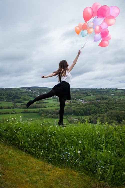
For this image my original aim was to have the model’s feet off the ground and being carried away by a balloon, however due to the model being in the grass I found this difficult to achieve. Instead of discarding the image I still wanted to see what I would be able to complete with this image even if it was not what I had originally planned. My new aim was to add in the balloons and to hide the white stool the model was standing on. To begin with I added in the balloon as I had use this technique many times to edit in objects as described above, once I had added the balloon I played around with the saturation and hue to see if I could make them more realistic.
The next step was to cover up the stool, I had thought of a couple of ways to do this, however I decided to copy the background and eases most of the image and blend it back on top of the area that had the stool. To begin with I copied the background layer so I still had the original layer as my base image, next I hid the original layer so once I started to ease my new layer I know what was left of the layer. Once I had ease what I did not need I unhide the original layer and moved my new portion of the image over the stool. Once I had lined it up and was happy with where the smaller layer would be, I turned the opacity of the layer down so I could see part of the original layer behind it. I did this as I made it easier to see the models shoe which I started to add back into the image. To finish off I turned the opacity down of the easer tool to low and went around the new layers edges, so they looked more natural and blended better into the original image.
Original Image – Final Image –

Tools used –

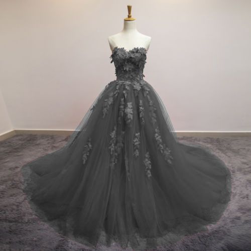
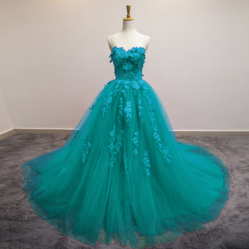
The next lot of tests I did I wanted to see if I could change the colour of a dress, as I had seen the technique done in one of Adam Birds work.
I already had an image that I was going to use as I test, as I had bought this dress for a shoot and wanted to know what it would look like when I changed the colour of it, as I could then use the techniques in future images. Once I had downloaded the image off of eBay, I then imported it into photoshop. I had not tried this specific technique before however I had tried similar one’s that used the same tools, so once the image was imported I used the lasso tool to draw around the dress, so the background wouldn’t not be effected. Once I was happy with the outline I created a new layer, which created a mask of the outline I had just done, with the new layer copied I then went to image> adjustments and then hue/saturation, and played around with the hue until I found a new colour I liked. When I was happy with the colour I went around the edges of the dress with a brush tool to take away any overspill of the mask or to add some more to the mask to hide any red that was showing.
I found this technique quite easy as the tools were simple to use and there wasn’t many steps that need to be done to achieve this look.
Original image –

Tools Used-

Final Results –
I am happy with how the final results turned out, as I think people would not realise that the colour of the dress had been changed if they were shown the images, However I do prefer the finished result of the grey dress as I think the result looks more natural compare to the teal dress. This is because I feel the colours done blend as well at the bottom of the dress and the colour is to vibrant for the design of the dress. By experimenting with the colours now I could see what worked well and what didn’t, which I can now take away and use in futures projects.
I have learnt a lot from trying new techniques and experimenting with photoshop in general, it has really helped me develop new skills and broadened my knowledge on post production. As I have now tried these techniques I will be able to use them in future projects and images, but also I want to try them again to perfect them and see if I can use the skill in a different way in a photograph.
